

可不可以有點用?RE:mark(𝑎𝑏𝑙𝑒)
「 可不可以有點用?」是希望標點符號更有用,也是希望有標點符號可以用。藉由我們的作品,說明標點符號也能有情緒,並尋找它更多的可能性,將其重新定義與詮釋;扭轉標點符號太正式、不有趣的形象,從接受他開始,一步步了解標點符號的可能與特性。
RE:mark(𝑎𝑏𝑙𝑒) promotes using punctuation marks in different ways. In addition to knowing the genuine function of each punctuation mark, they could understand those marks have emotions through our designs. We hope that RE:mark(𝑎𝑏𝑙𝑒) could help people get used to this culture, accept them, and eventually be willing to use them. Making punctuation marks become a part of people’s daily life.
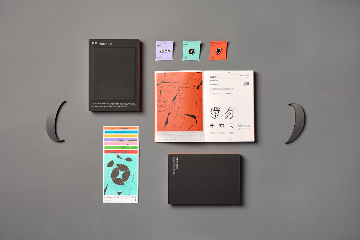
15 PUNCTUATION MARKS X PERSONALITIES
聚焦於15個常用的標點符號,並重新加以設計。統整大眾的看法,有了標點符號的專屬性格後,依據發展出個別視覺及延伸設計,最終彙集成書。希望透過我們所呈現的畫面,將標點符號的個性與特性直覺地傳達給閱讀者,讓一些不是那麼生活化的標點符號少了距離。
Focusing on 15 commonly used punctuation marks, we redesigned and reinterpreted them under a novel perspective. Finally, after investigation and integrating all the thoughts, the character of punctuation marks formed. In addition, the individual vision and extended design are well-developed as time passed by, assembling into a book as the result. Through the images we present, we expect to intuitively convey the unique personalities and characteristics of punctuation marks to readers, making punctuation marks to be a part of our daily life.


➀ FONTS X MARKS
現在的年輕人為求快捷,在日常通訊軟體的文字傳達上,往往會省略標點符號,並以空格、表情符號等取而代之。因此,我們為每個標點符號搭配一組日常用語,結合其個性和符號本身的用法,讓文字與標點符號成為相輔相成的存在,賦予其更多的可能性。
Nowadays, people tend to neglect punctuation marks on texting words for convenience. They are willing to leave a blank space between words or send an emoji rather than a punctuation mark. To turn the tables and make more possibilities, we designed a group of typefaces that combines punctuation marks and daily words, making the usage and personality into one, contributing to new opportunities.


➁ VISUALIZATION
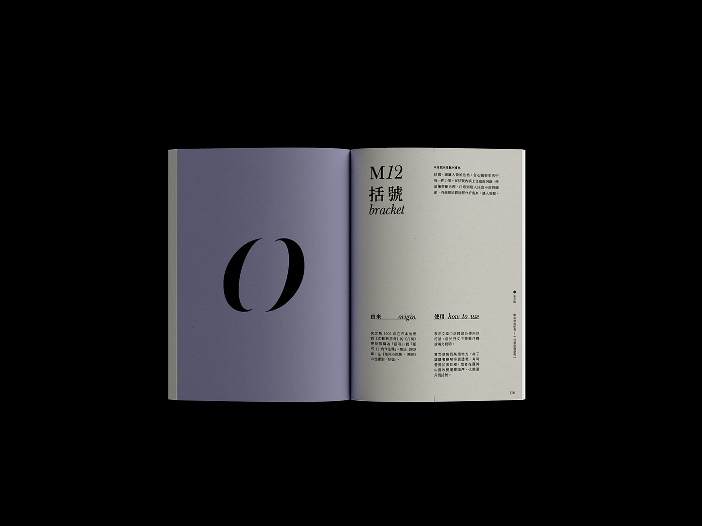
基於每個標點符號專屬的個性將其視覺化,溶入了符號本身的意義跟感覺,將這些符號分為活潑外向的橘色、理性穩重的綠色跟神秘細膩的紫色,呈現出獨一無二的視覺畫面。
Based on the personality of each punctuation mark, we visualized by the meaning and sensation of the marks to create a new unique image. These marks are divided into energetic orange, rational green, and mysterious purple.


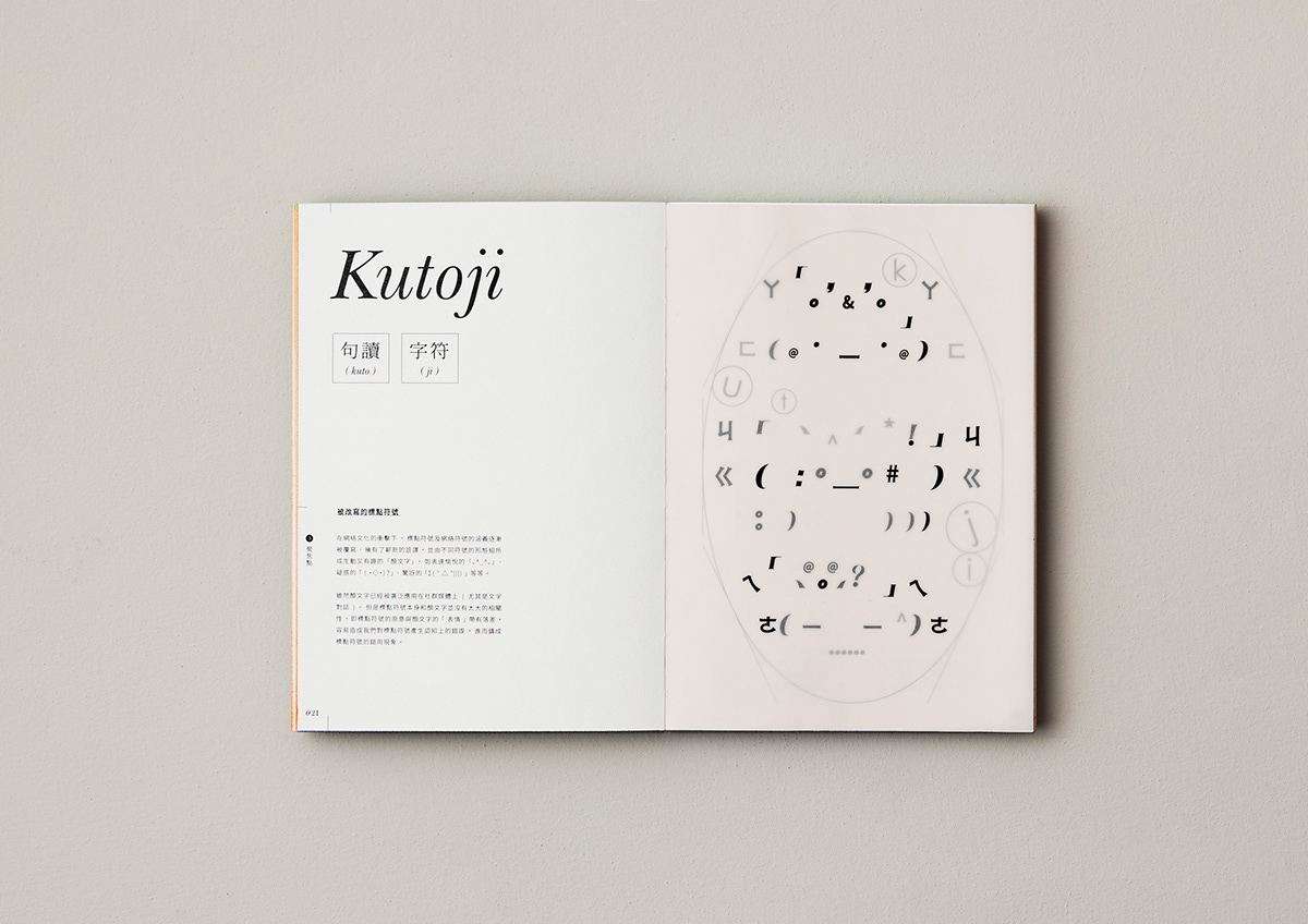
➂ KUTOJI
結合 [ kuto ],也就是句讀的日文,和代表字符的 [ ji ],所形成的一個新單詞——「 KUTOJI 」。既有的顏文字雖然運用了標點符號的外型,卻與其具體用法毫無相關。為此,我們依據標點符號的個性和用法,也加入了一些現代的網路元素,希望能讓正統又創新的 KUTOJI 有別於 EMOJI,變成標點符號的新可能之一。
Combined with " Kuto ", the Japanese of punctuation , and " ji " representing characters, a new word is formed " KUTOJI ". Although the EMOJI used the appearance of the punctuation symbol, it is not related to its meaning. Therefore, we redesign the EMOJI as well as the meaning of punctuation mark. We have also added some modern network elements, hoping to make the orthodox and innovative " KUTOJI " different from EMOJI and become one of the new possibilities of punctuation.

➃ MOTION GRAPHICS
以40秒的前導片開啟故事線,結合日常用語並放大標點符號不被接受的特點,最後去反思它被忽略的原因。另外,也將15種字體動畫化,希望透過動態畫面讓觀者更了解標點符號。
Opening the storyline with a 40-second introductory film, combining both daily expression and the unacceptable features of punctuation marks, leads to reflect on the reasons why it has been neglected. In addition, the 15 types of fonts are also animated, offering viewers to gain a better understanding of punctuation marks through the motion graphics.
INSTAGRAM : @re_markable___
DESIGNED BY LI, LING-RONG, NG, HOI-NAM, PUA, JIA-WEN, CHAN, CHUN-HO
LAYOUT & EDITORIAL : LI, LING-RONG, NG, HOI-NAM
ANIMATION & MOTION : PUA, JIA-WEN, CHAN, CHUN-HO
PHOTOGRAPHY : CHAN, SUI-HIN, VONG, HOI-KEI


